Do you want to renovate the interior or exterior of your house? The best way is to call the Pellizzari color devision. Get advise on which color to use from the thousands of possibilities available.
Come and touch…

Painting a house in Vicenza or Verona
Do you want to renovate the interior or exterior of your house? The best way is to call the Pellizzari. Let us advise you which colour to use from the thousands of possibilities available and then we will chose the finish together. All with the usual attention to the quality of materials and service.
Here you will meet, for example, Marco who has a long experience in the field of colours and plasterboard. We asked him: how do you chose the color of the house?
How do I chose the colors for my house?
“First of all, I tell you that there is no right colour for your home. There is the right colour for YOU. In short, you have to be brave enough and trust your intuition and your instincts.Changing color is no a drama.
Many are cautious and end up choosing neutral colours not because they like them, but because fear of making mistakes affects them too much”
The location of the rooms and the color
“Certainly the position of the rooms can influence the choice of colors. For example, if the room you need to paint receives natural light from the north it will tend to blue, so the environment will tend to be more severe and aseptic. these cases I recommend sensual, intense and dark colours, better if shaded or with a three dimensional finish.”
“If the position of the rooms is south the sun will give you a golden and intense natural light that enhances any colour, even if I would avoid white(for the risk of having dazzling environments) and light gray, which with the natural light tends to veer towards the cream.”
We also asked Chiara a question, who has been dealing with interior design for 20years…
Better to paint was with light or dark colours?
“Dark colours are indigestible to most people and few chose them. Most people, in my opinion, would like to try them but don’t dare to take the step, don’t dare to put them at home. I’m a big fan of dark colours, they are intriguing, sensual, mysterious, they enhance the surfaces. They add a theatrical, scenographic touch to the home interiors. They are suitable for hypermodern houses but also for traditional houses. It is a matter of chasing the right shade that can go from smoke gray to clay. I often recommend them to my clients in turnkey projects and I’m happy when they approve of them!”
What colours to use on the walls of the house
If you come to visit us we can decide together whether to use the nobility of blue tones, wether to warm the spaces with a touch of red or make it more cheerful by using yellow or if you prefer s reassuring beige, perhaps modernized by combining it with a turtle dove.
Jeans blue or melancholy blue?
Everything is fine with deep blue, you can combine it with a white wall, for a Mediterranean effect, but also with sand or with a light turtle dove for greater elegance. Another thing you can do, with blue, is to use it by combining other shades in the furniture, for example by combining other shades in the furniture, for example by combining the indigo, dark, with the cornflower, lighter. The combination of different shades of blue generates an interesting and relaxing environment.
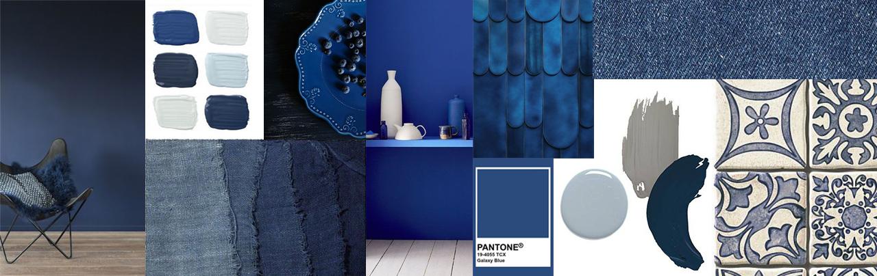
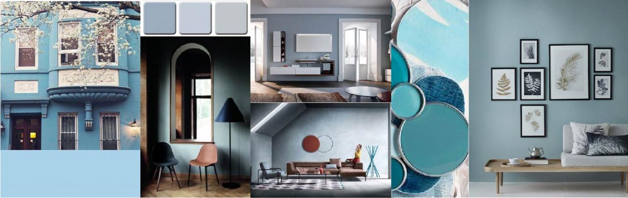
Light Blue (sugar paper)
Every self-respected male wardrobe must have a classic blu shirt. Because? Because blue is comfortable with everything and is pleasing to the eye. And for the walls? Wether you decide to use a very light blue, or with a hint of gray, you will notice how it fits in with all types of furniture, from white to black, passing through all intermediate colours.
Then, with wood, he goes to the wedding. If your house has wooden floor, try to hypothesize a blue sugar paper wall, or a blue “duck egg”.
Smoke gray and rain gray.
Mother nature gives us incredible landscapes when the fog falls over everything. But if the summer fog is lighter and evanescent the winter fog is darker and heavier, and takes on all shades of gray.
Do not listen to those who define these days depressing and think that in Japan they are considered the most beautiful days because they allow you to savor a thousand shades of light and to see things take on different colours. The gray on the walls is the perfect background to make every other object that stands in front of that wall become the protagonist. Any object, of any colour, will be turned on by the gray background.
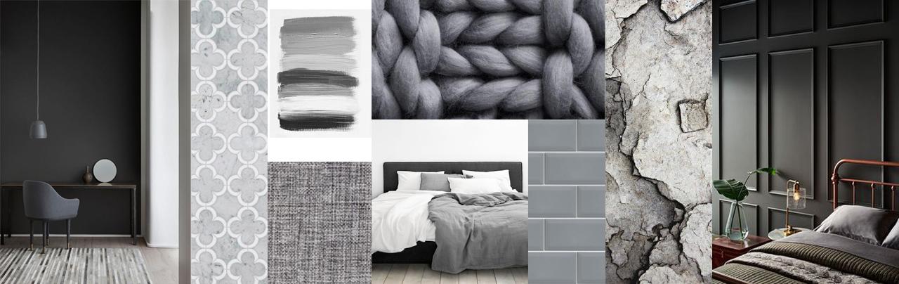
The stocky gray walls make every room elegant and is one of the preferred colours of interior designers because it does not affect you, and it fits with everything. If you enjoy changing home furnishings often, a neutral gray background is fantastic.
Clay, earth and mud
These are the soft golden tones that at the beginning go autumn colour the landscapes with shades raging from the burnt orange to dark brown, to the colour of chestnuts and chocolate. They are precious colours used to warm up a strong modern environment. They get along well with blue jeans but also with classic blue, the pantone colour of 2020.
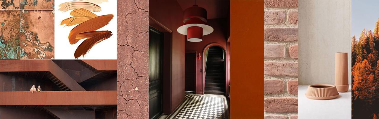
Hazelnut, terracotta and wood
These are colours capable of creating soft atmospheres that combine very well with light and neutral colours, such as sand and parchment. The tones vary from bronze to the earthenware pot, from hazelnuts to aged wood. They can be used in solid colours or shaded or spatulate and usually never on all walls, but choosing the most scenographic wall.
Forest green or moss green?
The love we feel towards the green colour comes to us from the love for nature that becomes poignant so far away in the office,you crave the green of the woods, the pines,the moss and the grass.
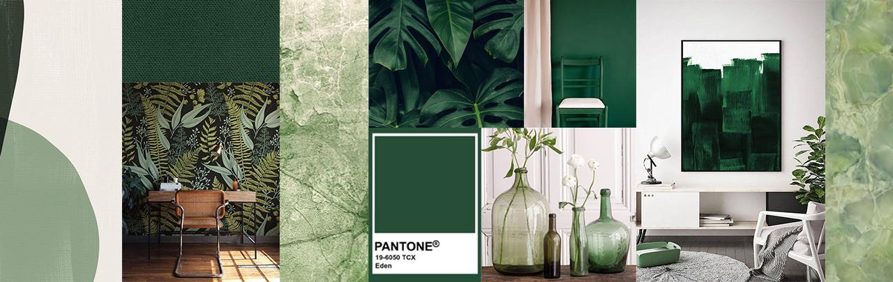
The colours of nature are restful for the gaze and for which it lives and inspires silence and tranquility. Green is available in many shades, in rich and deep shades, in other more nuanced and tending to grey.
It is not easy to think of one or more green painted walls inside a house, perhaps it is easier to think of a wallpaper that reproduces a forest or leaves.
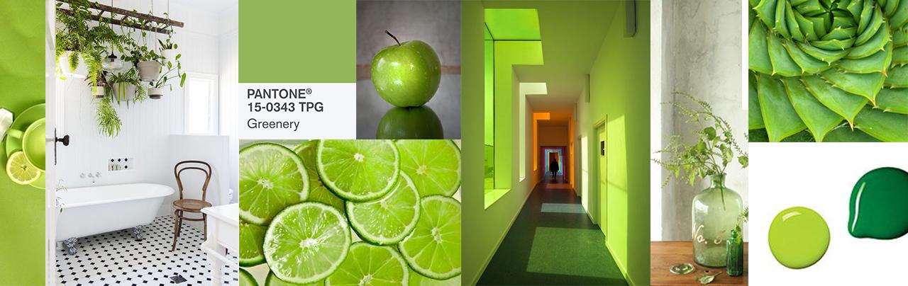
Fig green or apple green?
The brightest shades of the natural range are inspired by the green of figs, apples and the first tender spring leaves.
In comparison with the other colours of the range, this palette is much more vibrant, they are accent colours that give a cheerful and positive touch to any interior, regardless of the destination.
But painting an entire room with these works can be too invasive. As with other colours, the proposal is to paint a single was too create a focal point.
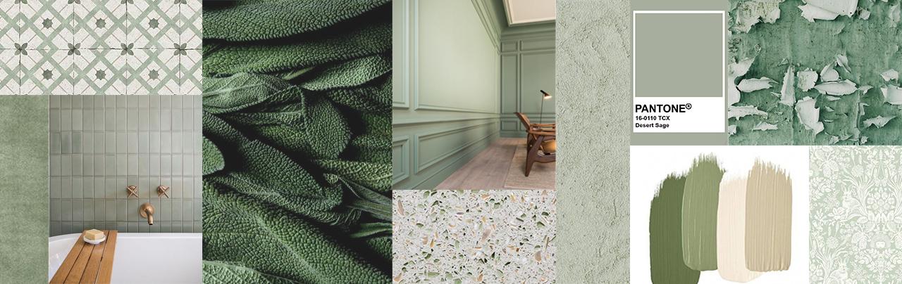
Olive, cactus, sage
The soft greens of the olive trees, the cactus or the river green of sage leaves are colours that are difficult to describe but beautiful. For this we have to thank mother nature who provides us with combinations of colours so beautiful that they take your breath away.
you can’t go wrong if you decide to use one of these tones combined with neutral and light colours in a wall of your home: it will help make your home look warm and inviting at the same time.
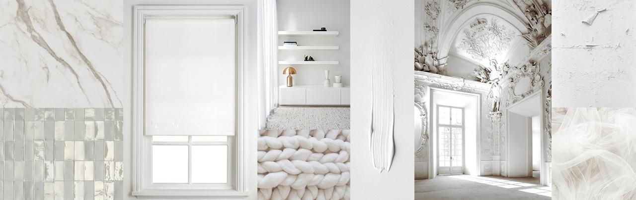
Snow white
White is the first option of many when it comes to choosing home colours. The fresh and pure aspect of the completely white environment is however boring and excessively “prudent”. White can be made less aseptic if we combine it with natural elements, especially wood, capable of giving that Nordic style sensation.
A second possibility is to work on the three dimensions, on the surface finishes and then highlight them with the right light. We like the white of snow because it wraps you and creates rounded shaped, such as white frost which creates perfect reflections and threads of light.
Light Colours: Ivory, rope and parchment
The warm tones os the light colours work very well also combined with a white because they add warmth while remaining in the same shade and prevent the room from appearing too lackluster and cold. They can be used for walls or in decorative elements (for example in curtains or furniture). But if you already have white elements, for example the doors and windows, you could choose warmer colours such as rope to contrast.
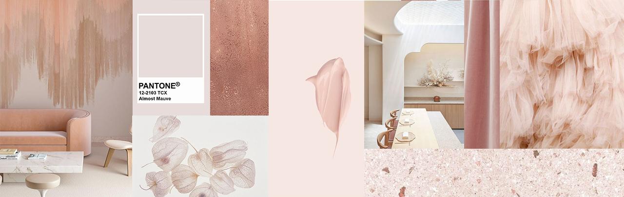
Blush pink or petal pink
Who knows who decided that pink was the colour for females and blue for males. The fact is that if you are a boy and you go to the gym with pink pants, be prepared to receive dirty looks and comments. But this tells us how some colours are suitable for certain things and not others. Pink is a colour with rich nuances that can be used on the wall instead of solid colour, which I do not recommend. Certainly a pink coloured environment, even if just mentioned, immediately becomes romantic, delicate and sweet. But pink can become more intense, like that of a poignant sunset and in that case the wall painted in intense pink becomes dramatic, more serious. Needless to say that pink goes well with an intense gray or lilac gray.
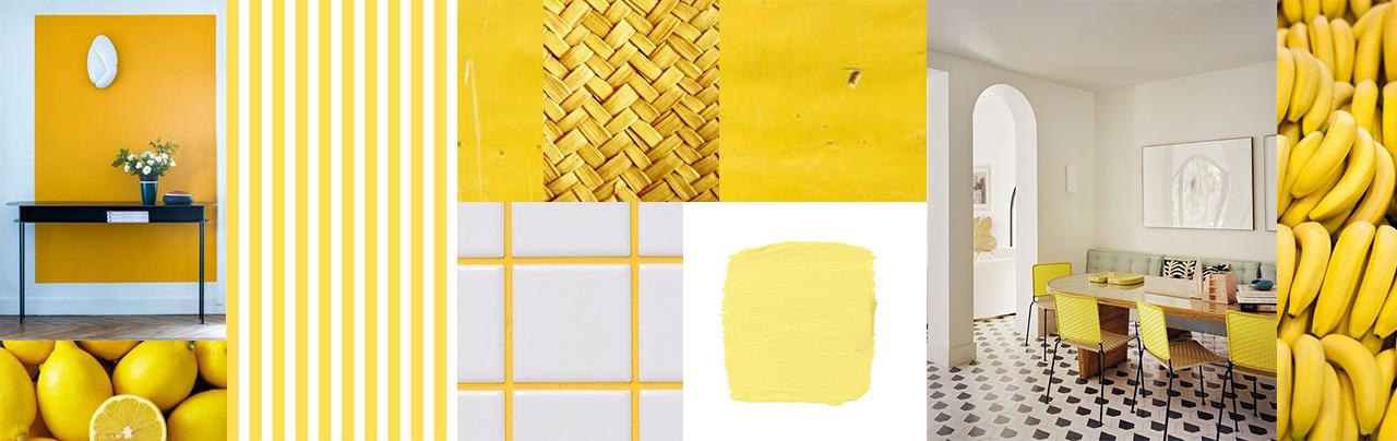
Dust yellow, wheat yellow, corn yellow and linen
Last but not least are the yellows: enchanting colours for walls of the whole house. Powder yellow in particular is not a pure yellow but has a touch of black. This allows us to avoid too intensive shades of yellow. The result will be a welcoming and inviting house, full of light. You can choose to have warm or cold tones.
If the rooms are to the north and not too brightly lit, the yellow powder will lighten the environment without being vulgar.
What colour brands to use?
Thanks to the reliability of Kerakoll and the beautiful Oikos catalog, together we will be able to touch the many colour processing techniques, finishes and effects. In our shop you will also find the incredible Graesan decorations with all the accessories and kits necessary to apply them and give the right effects.
Together we will choose the one that best suits the floors, walls and furnishings of your home.
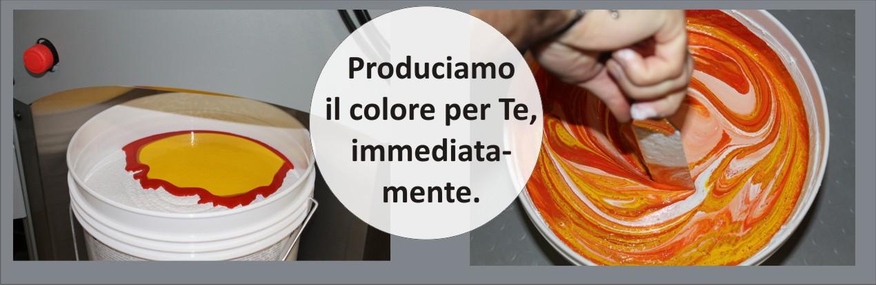
Once we have chosen the colour we can produce the paint on the spot thanks to the 4 tintometers installed in the the shops in Arzignano and Gambarella in Vicenza.
Painters in Vicenza?
Expert craftsmanship who collaborate with us which are coordinated by two site managers specialized in the world of painting, will take care to put the best of what has been chosen together. We are able to create internal or external painting of your house in the whole province of Vicenza and Verona.
Together with the colour, we can implement interventions to solve rising damp problems or condensation problems.
Finally, to renovate your home, we provide Knauf plasterboard sheets both for sale and for the “turnkey” realization of works of all kinds: bookcases, fireplaces, round walls, bathrooms… We also have slabs for thermal and acoustic isolation.